Tuesday, November 20, 2012

Problem Solved??


I have always been concerned about displaying my work. My problem is that I dislike the thought of my work being framed behind glass. As my images are dark with over 50% of the image is near black, displayed behind glass, makes it difficult to see as the glass in front of the dark image turns the glass into a mirror. Trying to look at my work is near impossible as you struggle to see beyond the reflection of yourself. I first noticed this phenomena while I was at a Bill Henson exhibition. His images were hard to view through the reflection of the glass. I have tried a number of mounts in the past. 

Usually, I preferred to pin the print directly to the wall of the gallery. I have had my work mounted on craftwood. It is a good solution however the surface of the print needs to be sprayed with a lacquer finish to protect it. While this solves the problem, the lacquer flattens the print sheen (I prefer Satin/Pearl) thus reducing the intensity of the blacks within the print. I have also had prints produced on Canvas which also is a solution. While the print quality is good, colour intensity can be dulled. Another problem I have encountered with the Canvas is that it polarises the viewers of my work into two camps - those who don't mind the Canvas and views the image regardless of the substrate that it is mounted on - and those who have a bias against Canvas, believing that it is a cheap, amateurish surface that has a kitsch quality of a Kmart/Officeworks print (regardless of the quality of the printing/canvas). As soon as I say 'a work on Canvas' the reaction on some people's faces is of utter disgust - even without seeing the quality of the image.

After seeing a Masters students work I was repacking after assessment, I noticed two photographs mounted on Aluminum. Intrigued, I asked the student where she got these printed. She sent me the link to Print2Metal  which offered the following -  

  • Gives your image a breathtaking unique and contemporary look and feel
  • Enhances contrast, sharpness and colour saturation unobtainable by any other printing method
  • Inks infused into specially coated aluminium ensures a durable and archival scratch resistant surface
  • We custom make each print to any required size up to 30" x45"
  • Choose from 4 different finishes for the exact look to compliment your work
  • Really differentiates your work from photographic paper and canvas prints
  • Water and weatherproof makes them ideal for kitchens and bathrooms
  • No mould or mildew in humid climates
  • Easy to clean with our glass cleaner and micro fibre cloth
  • Lightweight and much more economical than traditional bulky frames with glass
  • Makes your image stand apart with its brilliant luminescence and vibrant depth of colour

I uploaded an image and three days later I received my sample print (above). I must say I was impressed with the quality of the print. It retained the quality of a photographic print (satin), however, having the image on metal has given an 'objectness' to the print akin to an old 'tintype' photograph. I am excited at the possibilities that these aluminum prints offer. Not only a super flat photograph (without warping), the metal print can be rolled or curved for exhibiting installations instead of flat images on a wall. Prints can be ordered with floating hangers, or presented in aluminum frames

Prices range from $100 up for a 8"x 10"/A4 print (excluding postage). Expensive? When you consider the price of printing a traditional print, framing, etc, the price is comparable.

Super flat prints, great colour, archival, scratch resistant, are my display problems solved? Too early to tell but what I have seen so far I'm impressed. If anyone else has used aluminum printing/mounting, I would be interested in hearing your views. 


Sunday, November 18, 2012

Begining at the begining....


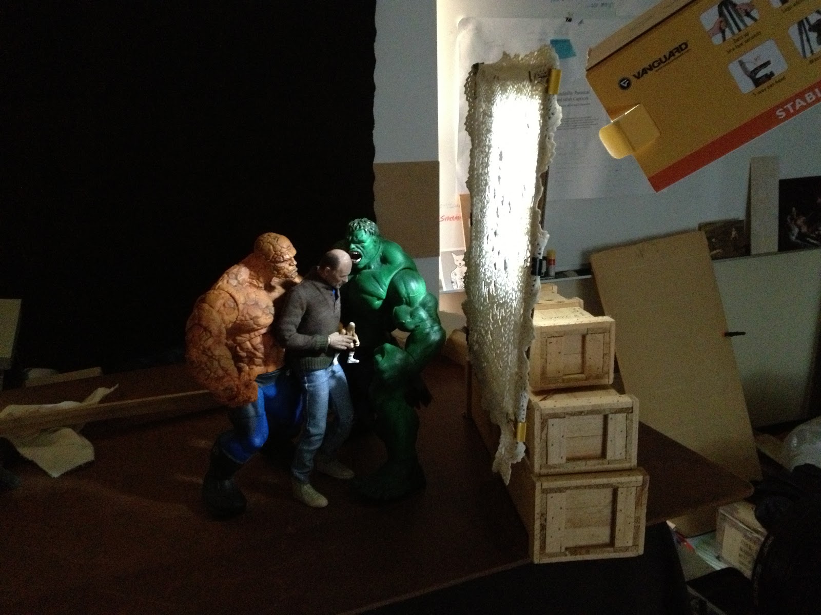
I went to my studio today and started playing with my new lighting set up. As I said in my previous post that I was concerned about the lighting in my artwork not being dramatic enough to convey the emotion as set up in my compositions. I decided to start from the start and re-work one of my old compositions Cultural Cringe (the image that appeared on the front cover of Trouble magazine - Dec 2010). 

I re-set the figures in nearly the same pose as before. I am happy with the new body I placed on the figure of me. It has far more articulation than the previous body and I can achieve more naturalistic poses than before. In a previous version of Cultural Cringe, the figure of me holds an armful of dolls, this time I chose only one, the message conveyed is the same. The Hulk and Thing figures are posed closer (more threatening?) to the Neale figure. I lit the scene with the MacGyvered snoot and placed the scrim - a doily on a frame between the light source and the figures (see above). I am really happy with the resulting image that came out of the shoot. I feel there is more emotive tension in the scene. The 'wow' factor for me is that in the depiction of the 'Neale doll', the figure has taken on another degree of realism than my previous versions of the image.

Now I have somewhat sorted the lighting issue, there are some of my old images that I will revisit. There are some that I will forget about entirely and I am sure that there will be more new work on the horizon. Should I tread over old ground? As this body of work is part of my Masters of Fine Art, I feel that  part of my 'research' is the artwork I have produced in the past and the experiments have been made with some success and some failures. Now may be the time to consolidate my research and start  producing some results.

Saturday, November 17, 2012

Playing with a new style...maybe

Even though I have not been producing  much over the last few months, I have had time to re-look and mull over my artwork over the last few years. While I am not  'unhappy' with any of my work, I have questioned the quality of my lighting. In some of my imagery, I thought the lighting could be more dramatic, more Baroque, with the play of chiaroscuro more intense. Below left is one of my images (The Reluctant Hero). This image was composed  


and lit by my normal methodology, a single direct light source. While giving the effect of dramatic lighting, I felt there was something lacking in this and some other images that I have done. My initial idea, my hope, was to have an image that is dramatic visually and conceptually compelling. While the image may hold up conceptually, I was uneasy about the lighting not matching the strength of the composition. In the image above right, I have changed (in photoshop) the contrast and deepened the shadows. I have altered the colour palette to be cooler and less saturated. I also added more space around the figures. I am happier with the visual impact of the second image, the sense of drama with the figures emerging out of the blackness without being fully lit. Instead of every detail being shown, I am comfortable losing some of the image to the darkness allowing the viewers own imagination to fill the void.

Saturday, November 10, 2012

New lighting experiments and a re-think. (A repost)


Spent some time in the studio making modifications to my lighting equipment. I don't really use anything 'high tek' for lighting, a single LED video light (purchased on the cheap on eBay). I needed to make a 'snoot' to limit the light to a narrower beam. I used an old tripod box and duct taped it to the light. A simple MacGyvered snoot. I also needed a scrim to shine the light through to create a mottled light pattern. I used an old 'doily' clamped onto a cardboard frame. I will need to get some stiff wire and make an adjustable stand for it.

I have been rethinking my imagery over the last few months, not so much the content but the visual style. Although I love the Baroque style in which I have been producing art in the past, I am thinking about a style that is not so stylistically slick but something more emotionally evocative. Darker, more shadows, less formal compositions. I would still be referencing the tropes from art history but not full appropriation of the scene - gestures, poses, interaction between figures. If you know your art history, you should be able to pick the reference. In the past I have played a game with my audience with referencing of art history which has been fun. However, there has been some of my images that does not necessarily reference past artworks and when questioned about the original inspiration, I sensed some trepidation when I explained a particular image does not have some link to the past but an original composition of my own. Maybe my own paranoia has set in but I started to question my work. Was the strength of my work only due to the fame of the past masterpieces and my non appropriated image a lesser work? 

So a rethink is in order. Experiments, re-shoots, a time to go over old ground and rework past images. I think this is what art making is all about, sometimes it is easier to make new work than to be brave enough to revisit the old. 

Sunday, October 28, 2012

Short Artist Statement draft

My art is about the human condition - delusion, desire, sex and death. Within my work the viewer should not expect easy answers but may be confronted with their own personal questions to ponder. Uncomfortable as it may feel, if any answer is found, it speaks more about the viewer than it does me. I offer my art as a reflection of my soul. Like the reflections on the walls of Plato's cave, the imagery is distorted, a mere simulacrum of reality that can only be interpreted through the prism of your (the viewers) own mind.

Saturday, October 27, 2012

Welcome to the beginning of my new blog which will be focused mainly on my artwork. My art this year has been stymied by a tumultuous year with health issues and the sudden passing of close family members. This blog is an attempt to get the creative juices flowing, to take stock of the past, to review my art that I have created in the past and what I have produced for my Masters of Fine Art so far.  I intend to post images that I produce as I go. I will probably post 'behind the scenes' imagery, pics of experiments and tryouts. I cannot promise any fundamental revelations. Nor can I promised a polished blog of coherent mutterings about art, philosophy, life, universe and everything. This blog is for me to get the ball rolling again. What else comes out of it will be just as a surprised to me as it will be to you. Come join the joyride.