Saturday, January 26, 2013

Invasion Day and other stories


Invasion Day. 2013
I am a proud Australian and that is why I dislike Australia Day. I find the patriotism is as shallow as the foreign made Australian flags displayed proudly by all and sundry today. Why I am uncomfortable with Australia Day is that the 26th of January is the wrong date to celebrate as a national day. 

I fully understand why my Koorie friends feel hurt and anger because on this date in 1788 their ancestors had their lives irrevocably changed as a culture. The 26th of January if anything should be called rightly Colonisation day. 


We should celebrate our national day on the 1st of January - Federation Day. The day in 1901 when we became a nation onto ourselves. A day when we released the shackles of our British colonial roots. Federation day would be devoid of any colonial baggage as we can celebrate a date when a nation was born, a beginning of the new 'Age of Enlightenment' leading up to what we have become today - a modern sophisticated culturally diverse nation that embraces all our citizens no matter where they are originally from. 


As our Aboriginal people feel that today is 'Invasion Day', the 26th of January will never he inclusive of all Australians. It is a date that will forever drive a wedge in our nation and perhaps should be abandoned. 


Maybe it is time as a grown up nation we have a public holiday that recognises our traditional custodians - Reconciliation day. A day we can say thank you to the Koories for their role in our nations history, a day we can recognise past wrongs and a day we can move forward and build this nation together as one. I suggest February 13th would be an ideal day for this to happen. Why that date? Most Koories would remember where they were on that remarkable day in 2008. Do you?


Invasion Day, 2013, is my personal response to Australia day and some of the troubles associated with it. The invasion in my image talks about the  'Bogan' attitude that has pervaded this day for some time. The wearing of the Australian flag by loud drunken yobbos that use the day to belittle and abusing anything that is remotely 'foreign'. The bare breasted woman holding the flag evokes Liberty Leading the People (1830) by Eugène Delacroix. 


Admonishing Dwarfs. 2013.
In Admonishing 
Dwarfs, 2013 also

use an image from art history, from Jacques-Louis David painting The Death of Socrates (1787). Instead of the great Socrates admonishing his students at the moment of his execution by poisoning, my image has me surround by dwarfs from Snow White. Personally I think Grumpy is conniving something. Never trusted him. 

Saturday, January 12, 2013

Cultural Cringe/The Confidante


Cultural Cringe. 2013.


Just to fill you in on the latest two works that I have been working on this week. Cultural Cringe is an image you may recognise and may believe you have seen before. It is a subject that I have tackled before over the few years. The images uses the same figures as before - The Hulk, The Thing and myself. The first time I created this image (in 2010) I just had the three figures, the two 'creatures' looming over me, threateningly. I was introducing the premise of some of the 'bullying' that I suffered in the past. It was a strong image (that even appeared on the front of Trouble magazine Nov/Dec 2010). Over time I grew dissatisfied with it. I wanted to reinforce the bullying aspect but also introduce the reasoning behind the 'Cultural Cringe'. In 2011 I revisioned the image, this time in the landscape format. My figure held a armful of action figures and positioned between the two beasts. Again not  happy. I soon felt that the landscape format didn't suit the image and the armful of action figures looked clumsy. At the end of last year I attempted the image again, this time back in the vertical/portrait orientation. This image had only one 'wrestler' figure. While better than the 2011 image, I still wasn't quite happy with it. So I though I would get this image out of my system and have one last crack at it. I repositioned the two beast in a more threatening position and instead of holding a action figure, I am holding a 'Barbie' doll. For me this is more what I was after compositionally and also with the figure of me holding the doll speaks more about the difference culturally that I experienced being who I am and those in the past who did not understand (or did not want to) who I was as a human being compared to them.

The Confidante relates more to friendship, to absolute trust in a person. For me, it was easier to open up to a 'lay figure', my action figures. These true friends were easier to play with than with other children - easier to socialise with. No chance of being judged, to ridiculed and picked on. A chance to play safe from the complicated outside world of (social) rules and regulations. A time to be myself and not conform to the complex world where the expectation is always normality without 'acting' to get along with others. 

Monday, January 7, 2013

The Debate.

The Debate. 2013
If you have been following my art practice, The Debate, 2013 could be an image you think you may have seen before. I have said previously that 2013 is going to be a year of renewal. A chance to sit back, look over previous works, redo some if I feel that I could do better. The Debate is one of those works that I felt needed a bit of tweaking. In previous versions I had fictional characters surrounding the debate. I believe this new version with 'actual' people gives a stronger depth to the image. Also re-shooting on the better quality camera and different lighting has given the image a better atmosphere than the previous versions.

The Debate. 2011.
I don't have any  qualms about revisiting old images to see if I can improve. Others may say something like 'you have done that before, leave that to history, move on, etc''. For some of my works, yes, I will move on. Others, I look at and 'face palm' and think 'what was I on?' and 'you idiot'. But that is the nature of the beast. as artists, we grow, our tastes refine, we learn by our mistakes. I see some of the artwork that I have produced in the past not as blunders that should be forgotten but initial sketches for a greater works that as yet to be realised.

Tuesday, January 1, 2013

2013 - So it Begins.

Requiem for my Brother, 2013
So it is 2013, with the wretched 2012 just now a number that marks a certain space in history. Goodbye, good riddance. 

The Mayans may have been right all along. 2012 was a year of upheaval and of change. But now that we have seen the back end of that we can look ahead with optimism for 2013. A chance to move on, change, be reinvigorated, recharged. 

I am not one for New Years resolutions, as these are too easy to break. However, I do have some New Year 'Aspirations' to ponder.

Aspirations are a good term because you cannot 'break' an aspiration. You can delay an aspiration as they have no set time-frame to achieve.

So, what do I aspire?

1. I aspire to be a better person. Not just for those around me but for myself. I have to look after myself a little better than I did last year. This means fighting depression instead of giving in to it. To maintain my health. Not to be stressed. Not to be bullied. Learn to say 'No' more often.

2. I aspire to reinvigorate my art practice. 2012 was such a shit year that I am surprised that I even created anything at all. My goal (still not a resolution) is to make at least one artwork a week. I know this does not always work out as my art practice is time consuming but by next New Years I have at least 40 new works, I will be happy.

3. I aspire to do more research. As with Aspiration 2, 2012 was really a year of brain deadness. My focus was on other things and reading went out the window. My attention span was so short I couldn't even read a comic. I want to really focus on research and writing for my Master's this year.

As mentioned in my last post, I have a new camera. The first test for this camera was the image above Requiem for my Brother, 2013. This image has been in the planning stages for a while and I felt that I needed to do this. No art history references. This scene depicts the last time I was with my brother, when I found him after he passed away. This scene has been playing around in my head for months so I thought I would get it out of the way and make this my first image for 2013.

On a technical note, the camera (Nikon D800/105mm Micro Nikkor lens) handled the job brilliantly. Giant file size, sharp picture quality, camera worked intuitively in the studio. Fantastic. 

The Mayans were right. My Arcadian life ended in 2012 with the untimely death of my mother and brother in such a small space of time. In 2013 I have regenerated into a different man, different sensibilities, a different outlook. I guess in some ways this will make me a different artist- we will have to wait and see. However, I am still and will ever always be a 'mad man with a box' - and that will never change.


Sunday, December 30, 2012

New Camera, New Start. Nikon D800.

I have been looking for a new camera for a while. I was quite content using the Nikon D7000 and happy compromising with some of the shortfalls with the camera. Don't get me wrong, the D7000 is a great camera and will accomplish 99% of a photographers needs. However, I was looking for something more. When the specs for the Nikon D800 was released I thought that Nikon must have been eavesdropping on my dreams for the ultimate camera to use for my 'artwork'. For my particular style of photography, I was looking more for a studio camera more than a general purpose camera. 
The specs above the D7000 are impressive. A 36mp full frame sensor, Mirror lockup (to limit camera shake when shooting slow shutter speeds) and the ability to save files in an uncompressed TIFF format instead of the god awful RAW format. (While many will talk about the brilliance of RAW, it has the limitation of needing a special CODEC loaded to every computer the file needs to be seen on. TIFF can be read on any computer and is the most user friendly. Why hasn't a camera manufacturer had the foresight to install TIFF before?) The camera also sports a large 3.2 inch rear screen for previewing files. 
I also wanted to tryout a new lens. I have been using the 60mm Nikkor Micro for all my past images. On all my past DSLRs, the 60mm lens has a focal length of 90mm because of the small 2/3 sensor. As the D800 has a full frame sensor, the 60mm lens would be a lot wider than on the previous camera. This would be problematic for the way I shoot my images because this would mean that I would have to get a lot closer to the models to photograph them. Closer to the models means a shallower DOF (depth of field/focus) and also being physically closer means that you are in the way of the lights. For me, the 105mm Micro Nikkor was the perfect solution to the problem as I can be a distance away from the figures, giving room for lights, etc.

How did the camera handle in the first camera shoot?...brilliantly. The layout of the camera is intuitive and easy to use. Focus is lightning quick and responsive. The 105mm micro lens is a pin sharp. The camera is a dream to use in the studio. The D800 is a large camera and even more so with the 105mm attached. This is why I call it a 'studio' camera. In this configuration, the camera is bulky and I would hate to have to lug it around the city/national park. But in the studio mounted on a tripod, it is a sexy thing.

In post production, I got the biggest wow factor. Firstly, the files are huge. In my first shoot, I shot about 35 images and this was about 3.5 gig in file size. Wow. The final TIFF file I worked on after I was finished with it came in at about 220mbs in size.

The quality is magnificent. Of course I would say that after investing a lot of money into this camera. However, I really was awestruck at zooming in on the image and not losing quality making cropping and resizing a dream. I was happily working on some detail within an image forgetting that I zoomed in. The sharpness was incredible. When I zoomed back out, the area I was working on was so small, all the work I had done seemed insignificant.
So, what does this mean for me. Well I have a new camera, and being close to the start of a new year brings new ideas, changes to be made, re-shoots of old images. New sensibilities. After a tumultuous year, this is a time to regroup the senses, to move forward. I am looking forward to the challenges of the year ahead. 2013 will be a good year.

And what of the image that I shot during this test of the camera? I am still in the process of post production and will be ready in a couple of days. This will be my first image of 2013 - the first of many.


Tuesday, November 27, 2012

Photographing the Real


What makes a good photographic portrait? The quality of the print? the lighting? photographic technique? or is it the subject themselves? We have here formal photographic portraits of well known persons. Each image uses the formal tropes of fine art photography. High quality prints, beautiful lighting, etc. The photographer captures the sitter in a simple pose allowing the 'essence' of the person, their aura to be displayed to the viewer.  However, if we study the pictures closely, there is a portrait of Rembrandt who died 200 hundred years before the invention of photography. What are we actually seeing? 

The photographer who created these enigmatic images is Hiroshi Sugimoto. Sugimoto who is famous for his seascapes and images of empty cinemas has been allowed to enter the great Wax museums to photograph the famous (or infamous) people of the world. The artist has not photographed flesh and blood. These are glorified still lifes. Any projection of reality is coming from the viewer alone. The wax sculptor can take some of the credit, but not all. These famous faces did not pose for the sculptor. The sculptor created their masterpiece from hundreds of photographic references and then created their own interpretation of the figure. What we see as reality is a construct from our own personal experiences, our own psychological baggage. 


What interests me about Sugimoto's work is that it is not much different than my own. I photograph 1/6th scale action figures. I pose them, light them, photograph them, make quality prints. The impression of any reality that comes from my work can be partly attributed to the sculptors of the action figures. However, it is the viewer interpretation of my work that adds any perceived realism as they are just a still life. It may be how I pose the figures, or what figures I use that triggers a 'hook' within the viewer. My use of a mixture of popular culture references and art history, may spark a memory allowing the viewer to engage with the image more readily.
  

My art practice does play on the notion of memory. Is a memory real? What is constructed and contrived compared with reality? Who's reality are we talking about? What part does delusion, desire and fantasy play in all this? Many questions to be answered.


Sunday, November 25, 2012

2012 CCP Kodak Salon


The image (right) is a installation pic from the Centre for Contemporary Photography Kodak Salon. The image top right is my entry to the Salon. I did not manage to get to the opening but Graduating Monash (Gippsland) student Tess Wright (whose wonderful image is bottom right) was there and took this installation pic. The Kodak Salon is on from the  23rd of November to the 15th of December.
 
Centre for Contemporary Photography
404 George St, Fitzroy
Victoria 3065, Australia


Tuesday, November 20, 2012

Problem Solved??


I have always been concerned about displaying my work. My problem is that I dislike the thought of my work being framed behind glass. As my images are dark with over 50% of the image is near black, displayed behind glass, makes it difficult to see as the glass in front of the dark image turns the glass into a mirror. Trying to look at my work is near impossible as you struggle to see beyond the reflection of yourself. I first noticed this phenomena while I was at a Bill Henson exhibition. His images were hard to view through the reflection of the glass. I have tried a number of mounts in the past. 

Usually, I preferred to pin the print directly to the wall of the gallery. I have had my work mounted on craftwood. It is a good solution however the surface of the print needs to be sprayed with a lacquer finish to protect it. While this solves the problem, the lacquer flattens the print sheen (I prefer Satin/Pearl) thus reducing the intensity of the blacks within the print. I have also had prints produced on Canvas which also is a solution. While the print quality is good, colour intensity can be dulled. Another problem I have encountered with the Canvas is that it polarises the viewers of my work into two camps - those who don't mind the Canvas and views the image regardless of the substrate that it is mounted on - and those who have a bias against Canvas, believing that it is a cheap, amateurish surface that has a kitsch quality of a Kmart/Officeworks print (regardless of the quality of the printing/canvas). As soon as I say 'a work on Canvas' the reaction on some people's faces is of utter disgust - even without seeing the quality of the image.

After seeing a Masters students work I was repacking after assessment, I noticed two photographs mounted on Aluminum. Intrigued, I asked the student where she got these printed. She sent me the link to Print2Metal  which offered the following -  

  • Gives your image a breathtaking unique and contemporary look and feel
  • Enhances contrast, sharpness and colour saturation unobtainable by any other printing method
  • Inks infused into specially coated aluminium ensures a durable and archival scratch resistant surface
  • We custom make each print to any required size up to 30" x45"
  • Choose from 4 different finishes for the exact look to compliment your work
  • Really differentiates your work from photographic paper and canvas prints
  • Water and weatherproof makes them ideal for kitchens and bathrooms
  • No mould or mildew in humid climates
  • Easy to clean with our glass cleaner and micro fibre cloth
  • Lightweight and much more economical than traditional bulky frames with glass
  • Makes your image stand apart with its brilliant luminescence and vibrant depth of colour

I uploaded an image and three days later I received my sample print (above). I must say I was impressed with the quality of the print. It retained the quality of a photographic print (satin), however, having the image on metal has given an 'objectness' to the print akin to an old 'tintype' photograph. I am excited at the possibilities that these aluminum prints offer. Not only a super flat photograph (without warping), the metal print can be rolled or curved for exhibiting installations instead of flat images on a wall. Prints can be ordered with floating hangers, or presented in aluminum frames

Prices range from $100 up for a 8"x 10"/A4 print (excluding postage). Expensive? When you consider the price of printing a traditional print, framing, etc, the price is comparable.

Super flat prints, great colour, archival, scratch resistant, are my display problems solved? Too early to tell but what I have seen so far I'm impressed. If anyone else has used aluminum printing/mounting, I would be interested in hearing your views. 


Sunday, November 18, 2012

Begining at the begining....


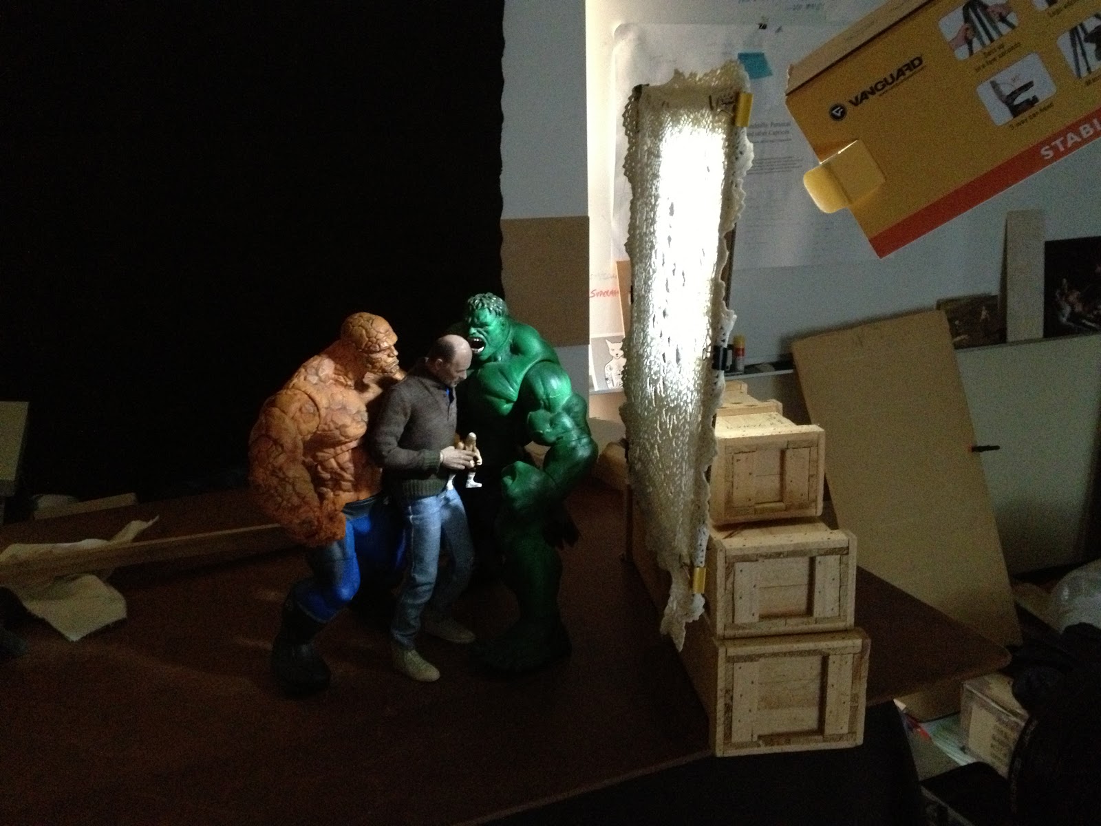
I went to my studio today and started playing with my new lighting set up. As I said in my previous post that I was concerned about the lighting in my artwork not being dramatic enough to convey the emotion as set up in my compositions. I decided to start from the start and re-work one of my old compositions Cultural Cringe (the image that appeared on the front cover of Trouble magazine - Dec 2010). 

I re-set the figures in nearly the same pose as before. I am happy with the new body I placed on the figure of me. It has far more articulation than the previous body and I can achieve more naturalistic poses than before. In a previous version of Cultural Cringe, the figure of me holds an armful of dolls, this time I chose only one, the message conveyed is the same. The Hulk and Thing figures are posed closer (more threatening?) to the Neale figure. I lit the scene with the MacGyvered snoot and placed the scrim - a doily on a frame between the light source and the figures (see above). I am really happy with the resulting image that came out of the shoot. I feel there is more emotive tension in the scene. The 'wow' factor for me is that in the depiction of the 'Neale doll', the figure has taken on another degree of realism than my previous versions of the image.

Now I have somewhat sorted the lighting issue, there are some of my old images that I will revisit. There are some that I will forget about entirely and I am sure that there will be more new work on the horizon. Should I tread over old ground? As this body of work is part of my Masters of Fine Art, I feel that  part of my 'research' is the artwork I have produced in the past and the experiments have been made with some success and some failures. Now may be the time to consolidate my research and start  producing some results.

Saturday, November 17, 2012

Playing with a new style...maybe

Even though I have not been producing  much over the last few months, I have had time to re-look and mull over my artwork over the last few years. While I am not  'unhappy' with any of my work, I have questioned the quality of my lighting. In some of my imagery, I thought the lighting could be more dramatic, more Baroque, with the play of chiaroscuro more intense. Below left is one of my images (The Reluctant Hero). This image was composed  


and lit by my normal methodology, a single direct light source. While giving the effect of dramatic lighting, I felt there was something lacking in this and some other images that I have done. My initial idea, my hope, was to have an image that is dramatic visually and conceptually compelling. While the image may hold up conceptually, I was uneasy about the lighting not matching the strength of the composition. In the image above right, I have changed (in photoshop) the contrast and deepened the shadows. I have altered the colour palette to be cooler and less saturated. I also added more space around the figures. I am happier with the visual impact of the second image, the sense of drama with the figures emerging out of the blackness without being fully lit. Instead of every detail being shown, I am comfortable losing some of the image to the darkness allowing the viewers own imagination to fill the void.

Saturday, November 10, 2012

New lighting experiments and a re-think. (A repost)


Spent some time in the studio making modifications to my lighting equipment. I don't really use anything 'high tek' for lighting, a single LED video light (purchased on the cheap on eBay). I needed to make a 'snoot' to limit the light to a narrower beam. I used an old tripod box and duct taped it to the light. A simple MacGyvered snoot. I also needed a scrim to shine the light through to create a mottled light pattern. I used an old 'doily' clamped onto a cardboard frame. I will need to get some stiff wire and make an adjustable stand for it.

I have been rethinking my imagery over the last few months, not so much the content but the visual style. Although I love the Baroque style in which I have been producing art in the past, I am thinking about a style that is not so stylistically slick but something more emotionally evocative. Darker, more shadows, less formal compositions. I would still be referencing the tropes from art history but not full appropriation of the scene - gestures, poses, interaction between figures. If you know your art history, you should be able to pick the reference. In the past I have played a game with my audience with referencing of art history which has been fun. However, there has been some of my images that does not necessarily reference past artworks and when questioned about the original inspiration, I sensed some trepidation when I explained a particular image does not have some link to the past but an original composition of my own. Maybe my own paranoia has set in but I started to question my work. Was the strength of my work only due to the fame of the past masterpieces and my non appropriated image a lesser work? 

So a rethink is in order. Experiments, re-shoots, a time to go over old ground and rework past images. I think this is what art making is all about, sometimes it is easier to make new work than to be brave enough to revisit the old. 

Sunday, October 28, 2012

Short Artist Statement draft

My art is about the human condition - delusion, desire, sex and death. Within my work the viewer should not expect easy answers but may be confronted with their own personal questions to ponder. Uncomfortable as it may feel, if any answer is found, it speaks more about the viewer than it does me. I offer my art as a reflection of my soul. Like the reflections on the walls of Plato's cave, the imagery is distorted, a mere simulacrum of reality that can only be interpreted through the prism of your (the viewers) own mind.

Saturday, October 27, 2012

Welcome to the beginning of my new blog which will be focused mainly on my artwork. My art this year has been stymied by a tumultuous year with health issues and the sudden passing of close family members. This blog is an attempt to get the creative juices flowing, to take stock of the past, to review my art that I have created in the past and what I have produced for my Masters of Fine Art so far.  I intend to post images that I produce as I go. I will probably post 'behind the scenes' imagery, pics of experiments and tryouts. I cannot promise any fundamental revelations. Nor can I promised a polished blog of coherent mutterings about art, philosophy, life, universe and everything. This blog is for me to get the ball rolling again. What else comes out of it will be just as a surprised to me as it will be to you. Come join the joyride.